


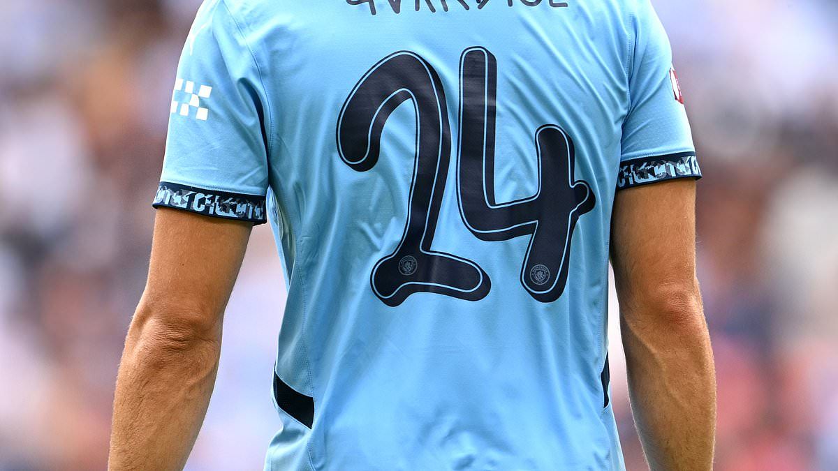
- An unconventional typeface was present on Man City's Community Shield shirts
- Font featured on City's proved hugely controversial among fans on social media
- Get breaking Premier League news straight to your phone on Mail Sport's new WhatsApp channel
Manchester City fans have taken to social media to express their disdain for the style of lettering featured on the club's shirt in the Community Shield.
Pep Guardiola's side entered the curtain-raiser at Wembley looking to avenge their defeat against Man United in the FA Cup final in May.
Despite their dominance the reigning Premier League champions had appeared in the last three iterations of the match without securing victory.
Both Manchester club's wore their new home shirts at the national stadium but it was City's that raised more than a few eyebrows among fans online.
A decidedly unconventional font that adorned the back of the club's shirt and proved hugely divisive, with one particularly enraged fan branding it a 'disgrace'.


Manchester City utilised an unconventional font on their back of their Community Shield shirts

The font will be a one-off as Premier League rules require all clubs to use the same lettering
One fan wrote: 'The font on the back of the Man City strip is an absolute disgrace. Heads should roll over this. Shameful.'
Another agreed: 'Have City chosen Papyrus for their shirt name font? Looks like the kit man forgot to put the names on and scribbled them on with a Sharpie in a panic'

A third added: '9 minutes into the new season and I'm getting annoyed by the choice of font on the back of City's shirts. I may need to pace myself here.'
A further fan joked: 'Can we add the font on the Man City shirt to the 115 charges?'
Another added: 'Never thought we’d ever see the day lads, but it’s here… Manchester City have managed to find a worse font than Comic Sans.'
Fans unhappy with the typeface will be pleased to know that it will not appear on the club's shirts for the coming Premier League campaign.
All lettering featured on top flight strips is standardised by the league, with the latest redesign produced by American company Avery Dennison introduced prior to the 2023-24 campaign.
City ultimately triumphed on penalties at Wembley as Manuel Akanji netted the winning spot kick.


Fans from both clubs couldn't help but express their disdain for the typeface on social media
Both teams had chances to take the lead in the first half, with City youngster James McAtee coming closest as his curling effort struck the bar.
Bruno Fernandes looked to have broken the deadlock in the second half as he curled a beautiful strike beyond Ederson before his effort was ruled out for offside.
United looked the more likely to score after the interval and Garnacho stepped up when it counted, cutting inside following a blistering run before giving his side the lead.
United looked to have secured the win before Bernardo Silva headed home from a Oscar Bobb cross in the final minute of normal time to send the game to spot kicks.
اخلاء مسئولية! : هذا المحتوى لم يتم انشائة او استضافته بواسطة موقع اخبار الكورة و اي مسؤلية قانونية تقع على عاتق الموقع مصدر الخبر : dailymail.co.uk [1] , يتم جمع الاخبار عن طريق خدمة ال RSS المتاحة مجانا للجمهور من المصدر : dailymail.co.uk [1] مع الحفظ على حقوق الملكية الخاصة بمصدر الخبر.


0 تعليق